Tagged #design-systems
Design system overviewGlossTiered components, tokens, motion and brand packages on npm.
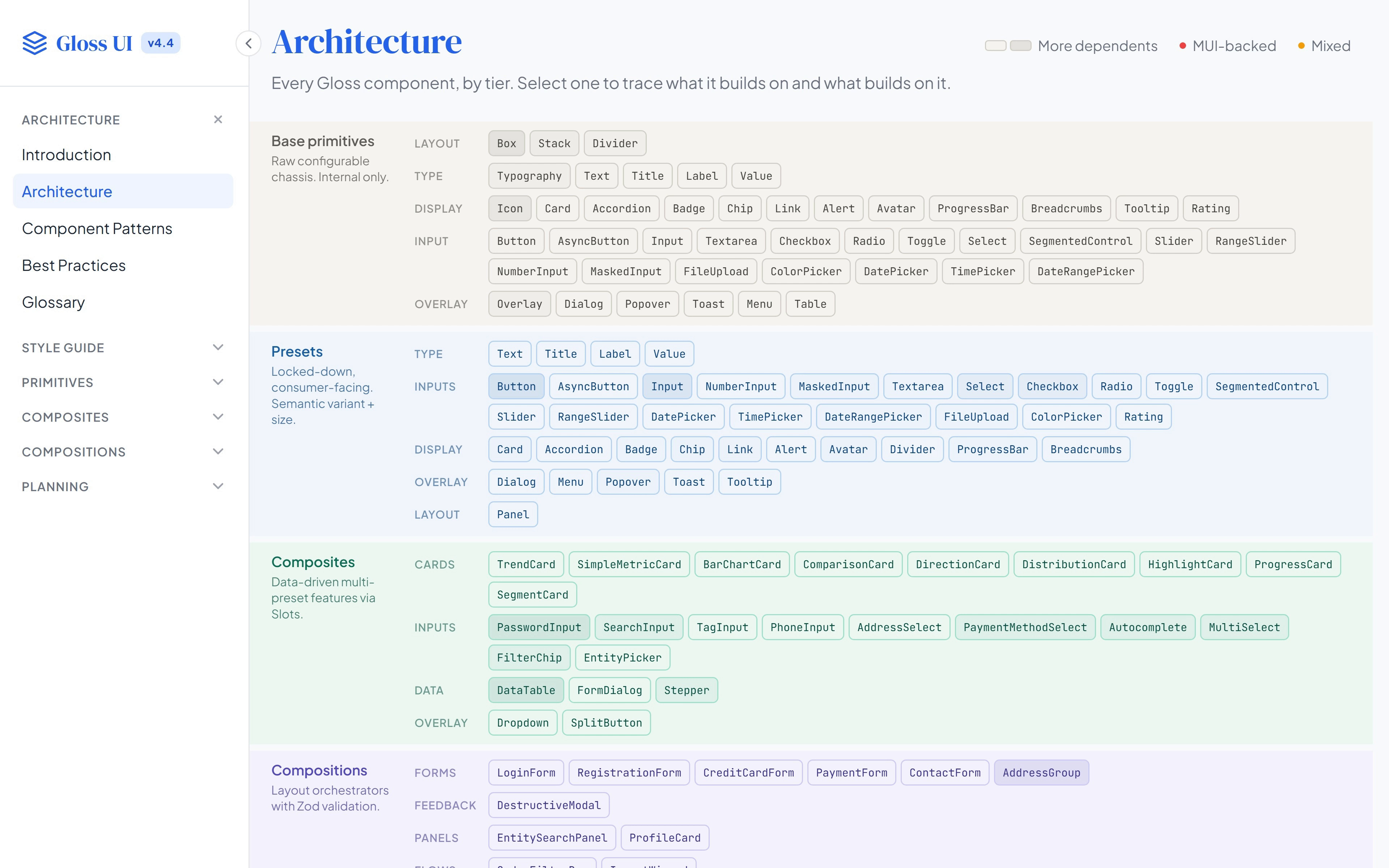
Component architectureGlossPrimitives up to whole sections on one chart, by tier.
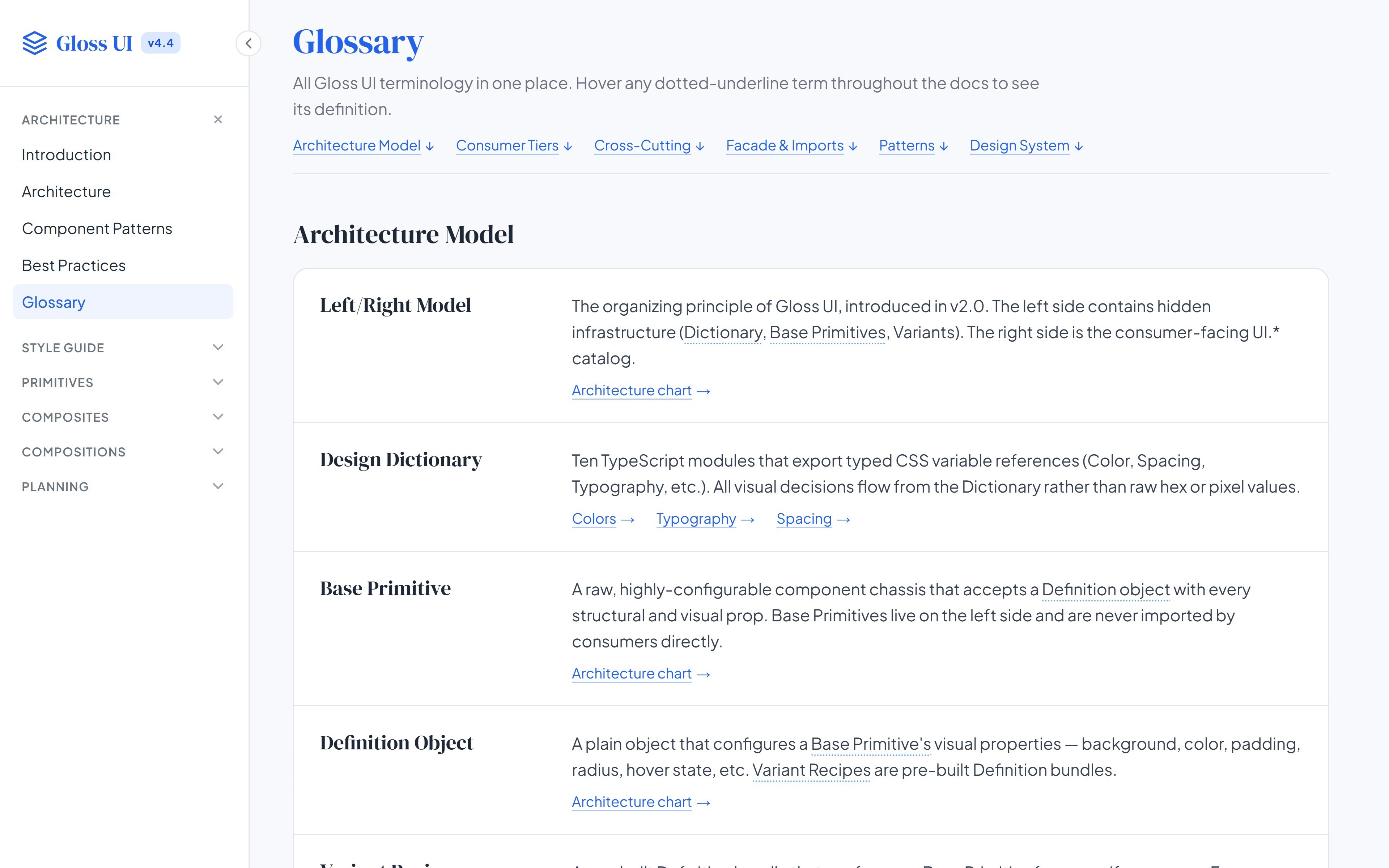
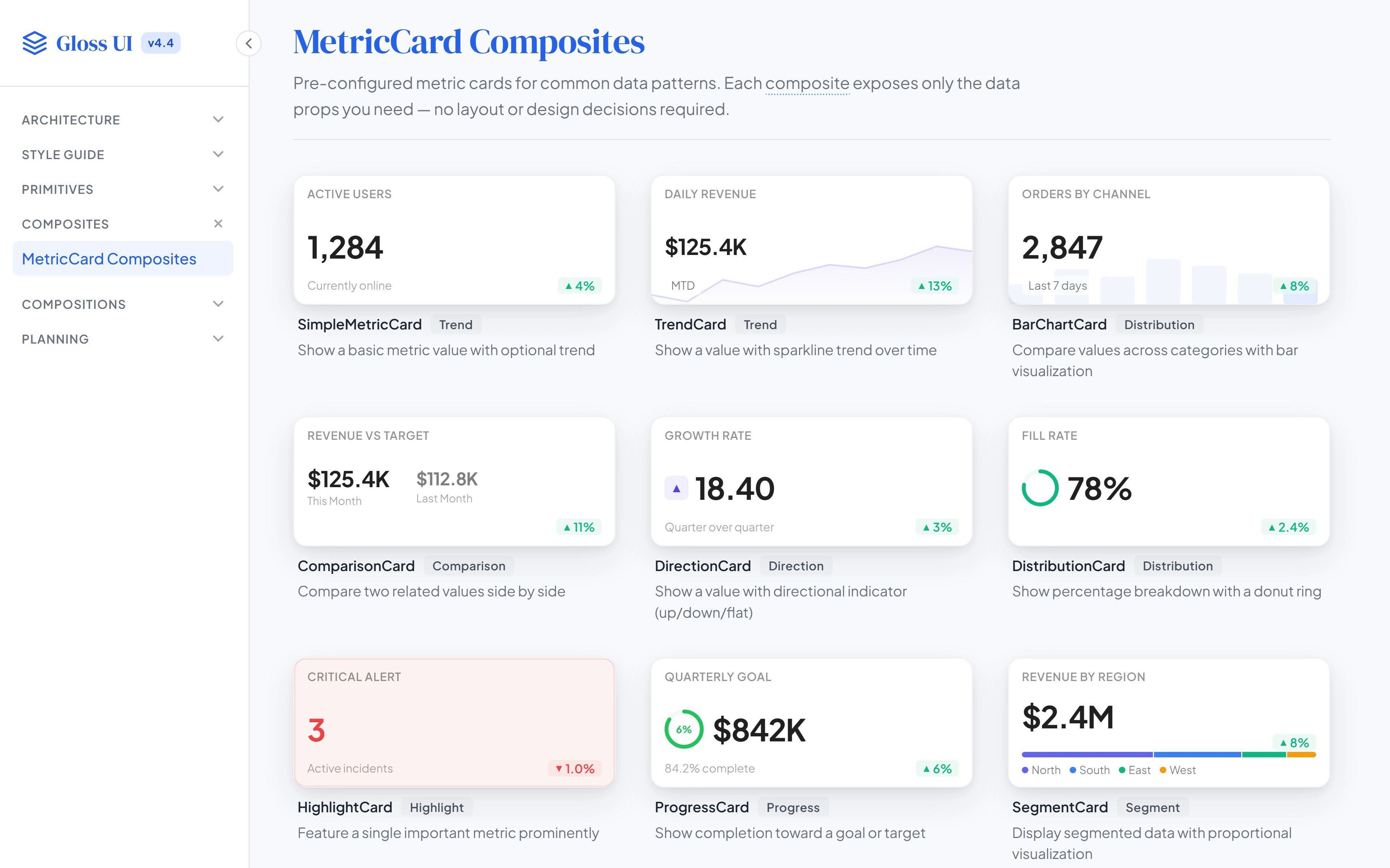
Documentation siteGlossThe glossary, the architecture and a live page per component.
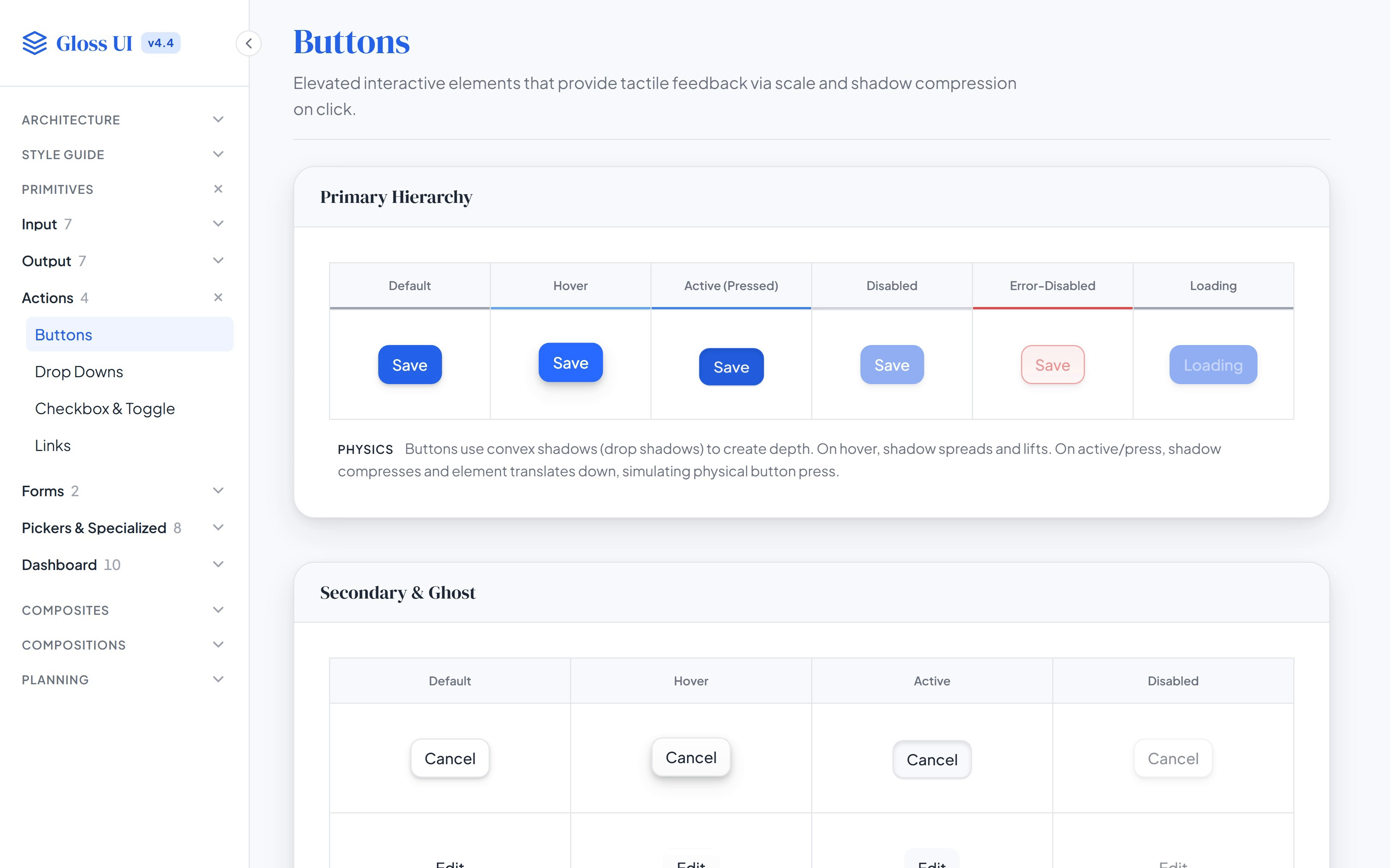
Components in every stateGlossButtons to pickers running live, each with a note on its motion.
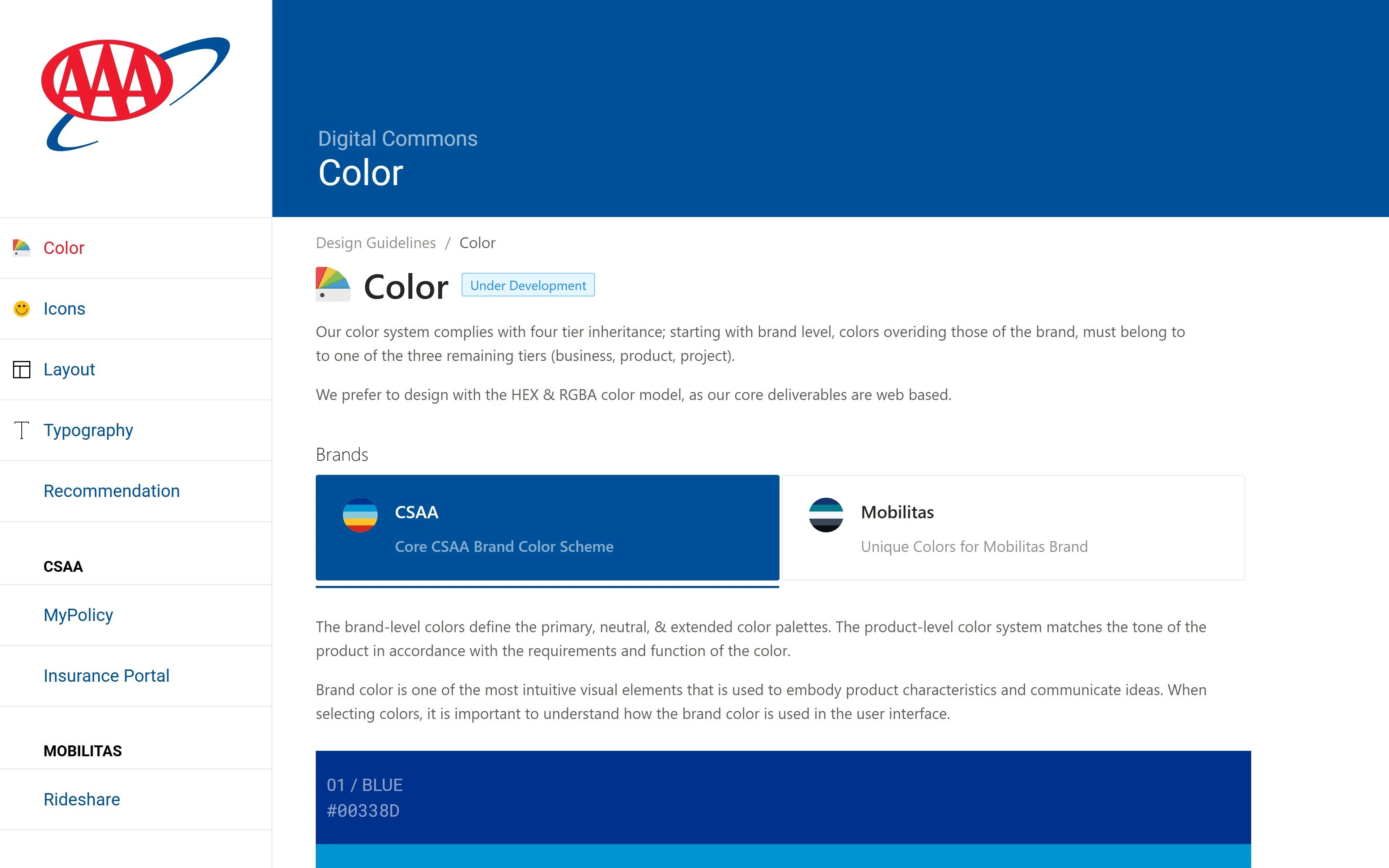
Style and component docs, still liveDesign CommonsColor tiers, typography, buttons and the Pixel library.
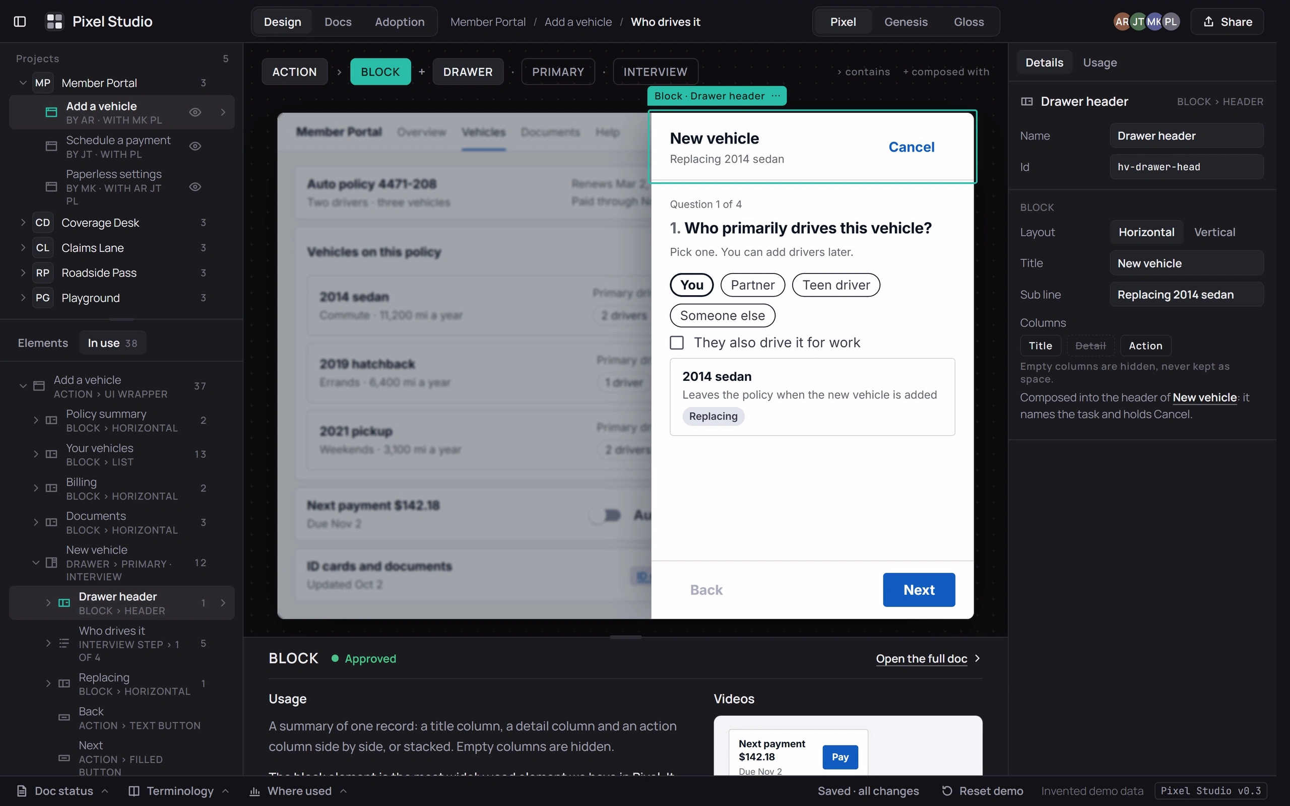
Layout tool with usage notes beside the canvasPixel StudioScreens built from a system’s elements and docs.
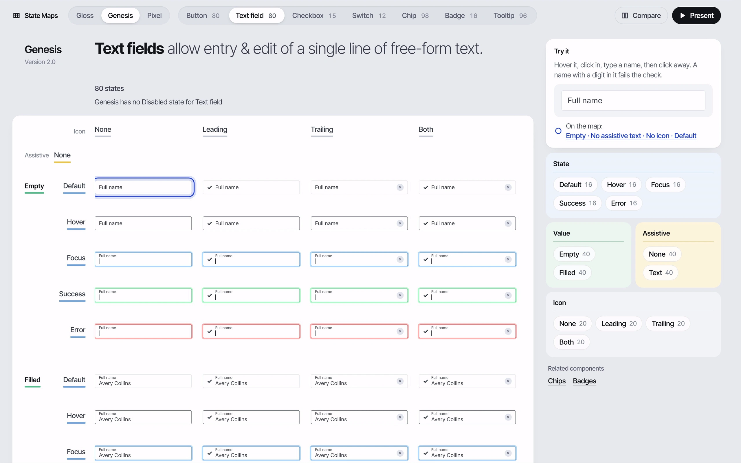
State mapsButtons to tooltips in every variant and size, across three design systems.
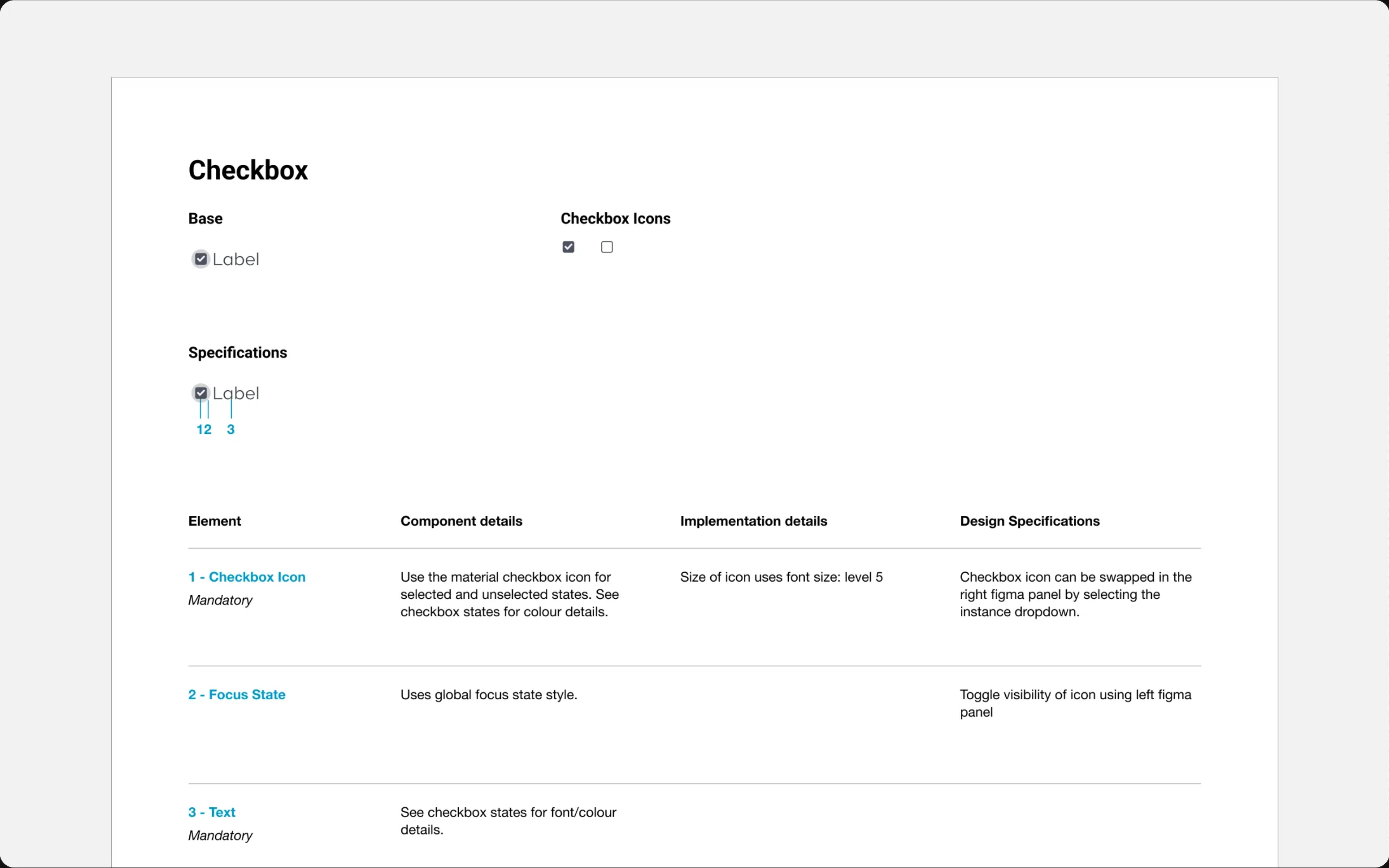
Property sheetsAnatomy and specifications for five components.
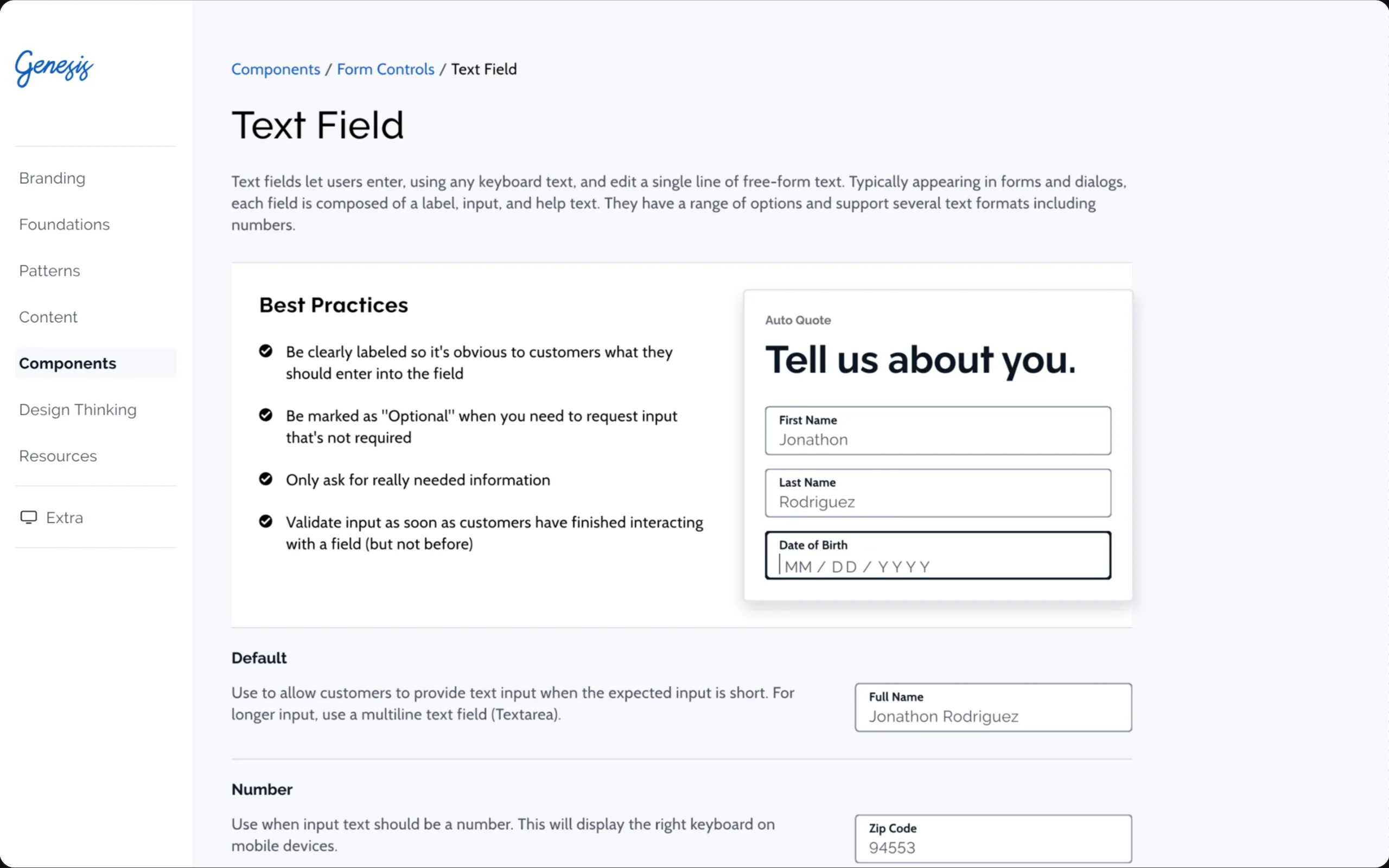
Usage guidelinesSix component guideline pages from a docs site.
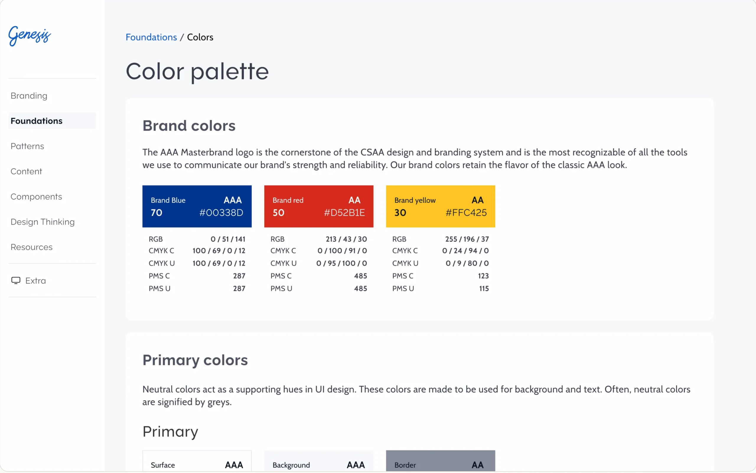
Foundation guidelinesColor, type, grid, spacing and elevation.
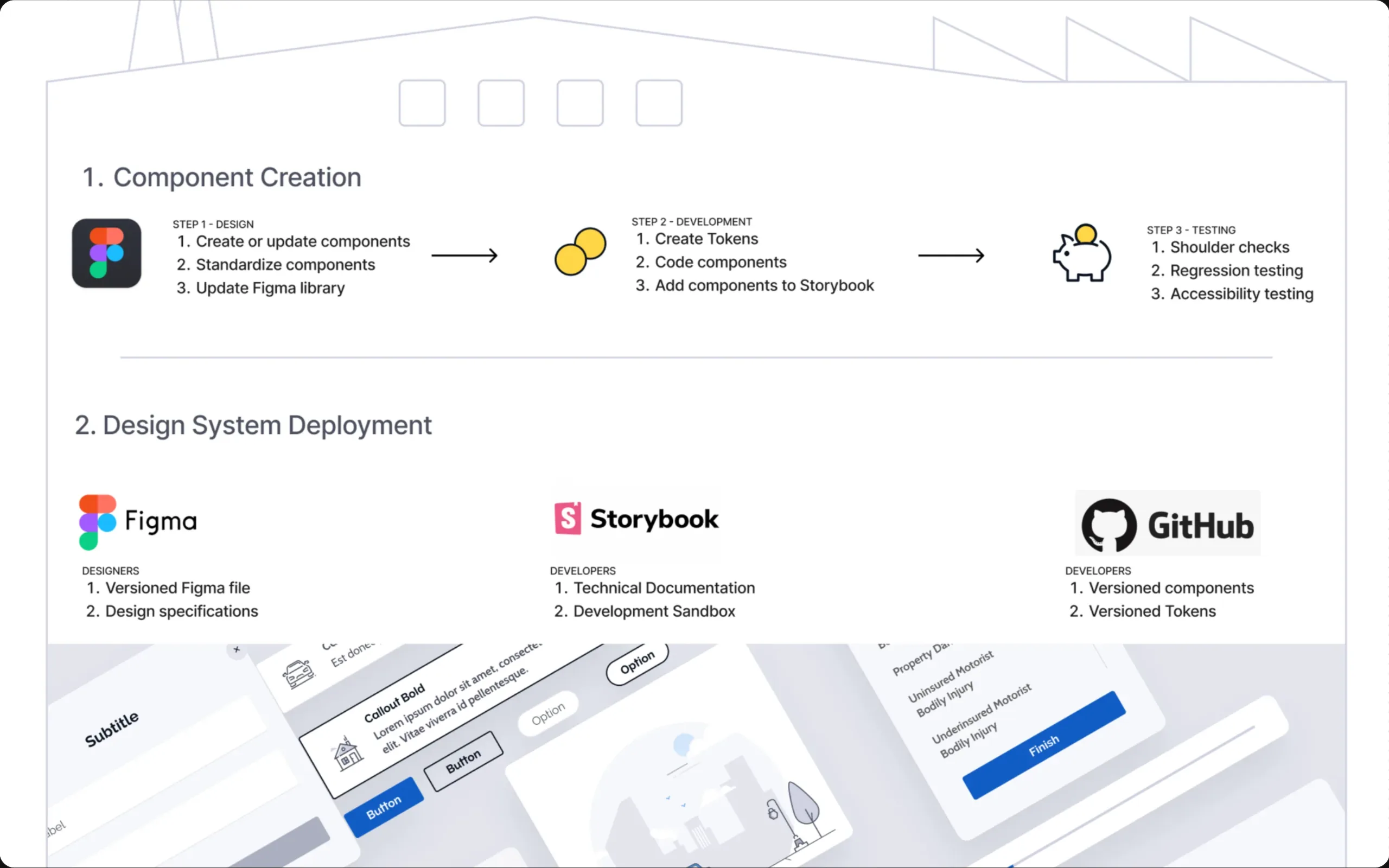
How a design system ranTwo diagrams: components made and shipped, tokens from Figma to teams.
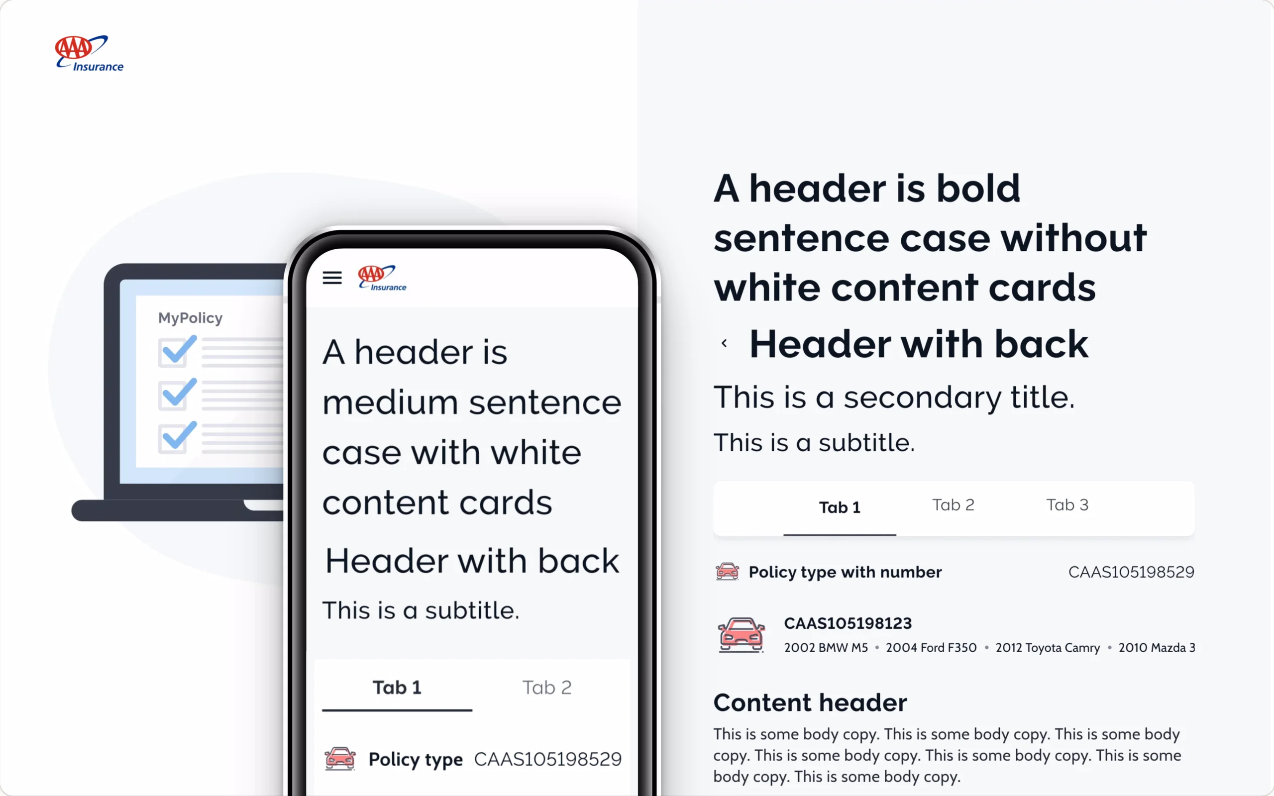
Component specimensHeaders, tabs, fields and cards, then put together as an app.
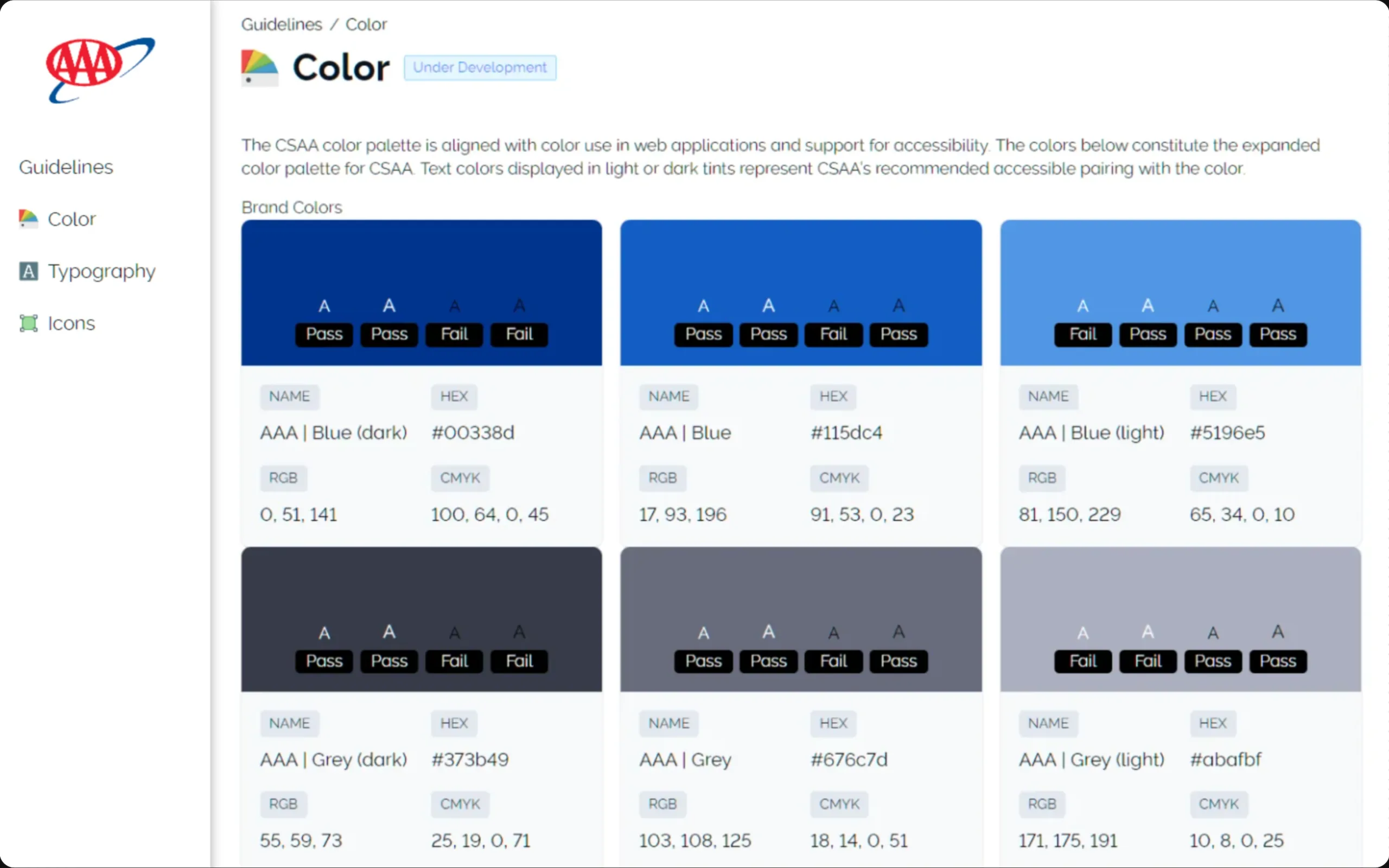
Style guides from FigmaColor, type and icon pages, plus the live components that build them.
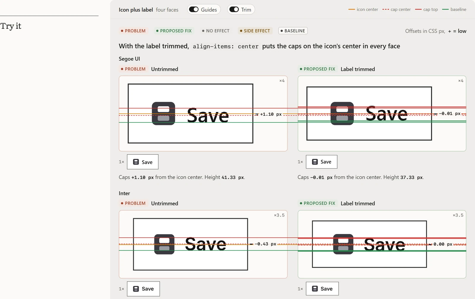
Where text-box trim centers a button labelOptical Type for ImpeccableA proposal and live demo for Impeccable’s type guidance.
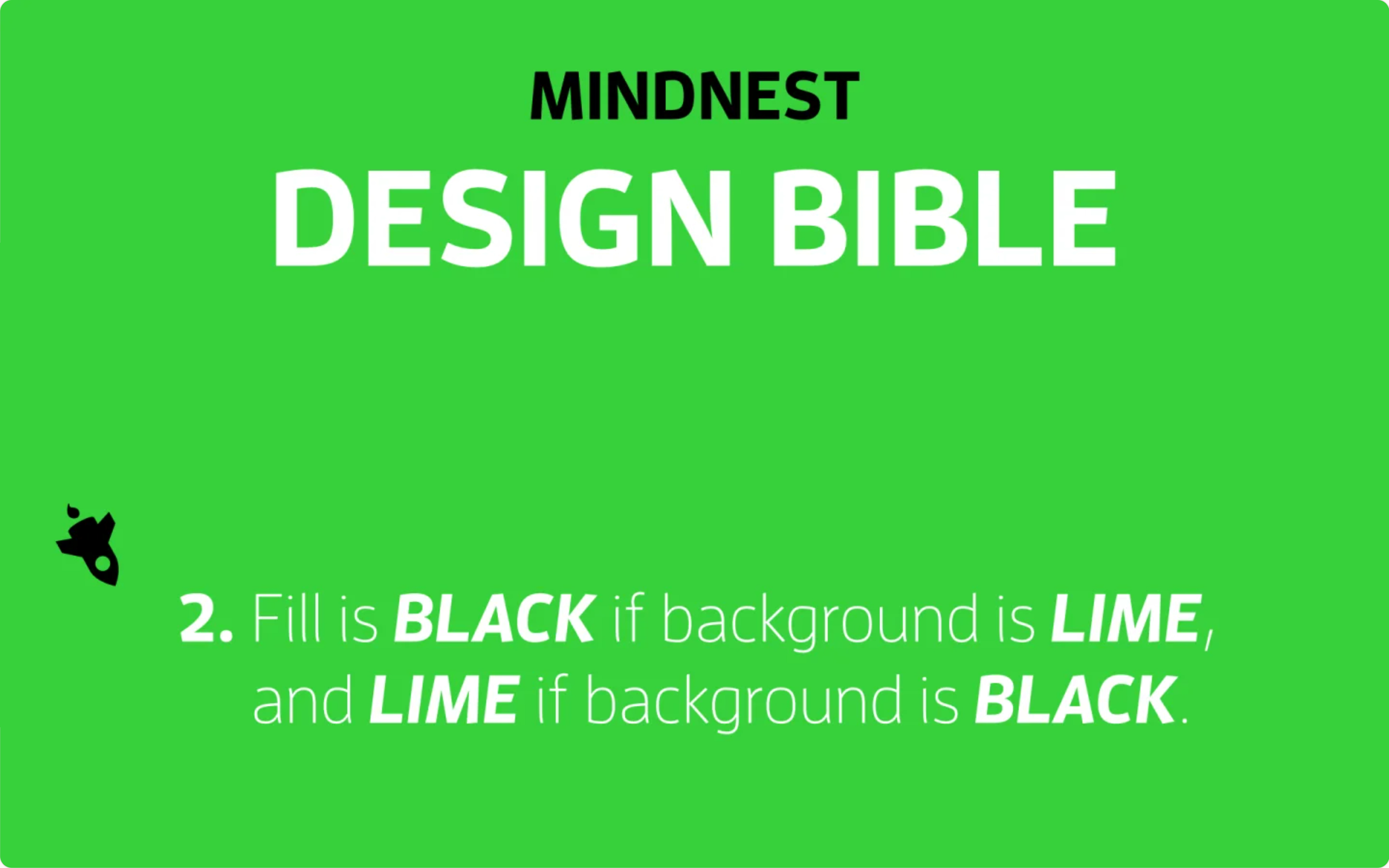
Two decks for new clientsIntro to UX and Style GuidesA 20-slide talk and a 30-slide walk-through of Mindnest’s Design Bible.
Want to talk about any of these?