
CSAA · Lead Designer · Team: +3 · Time: 6 Months (2022) · Visual Design, Design System
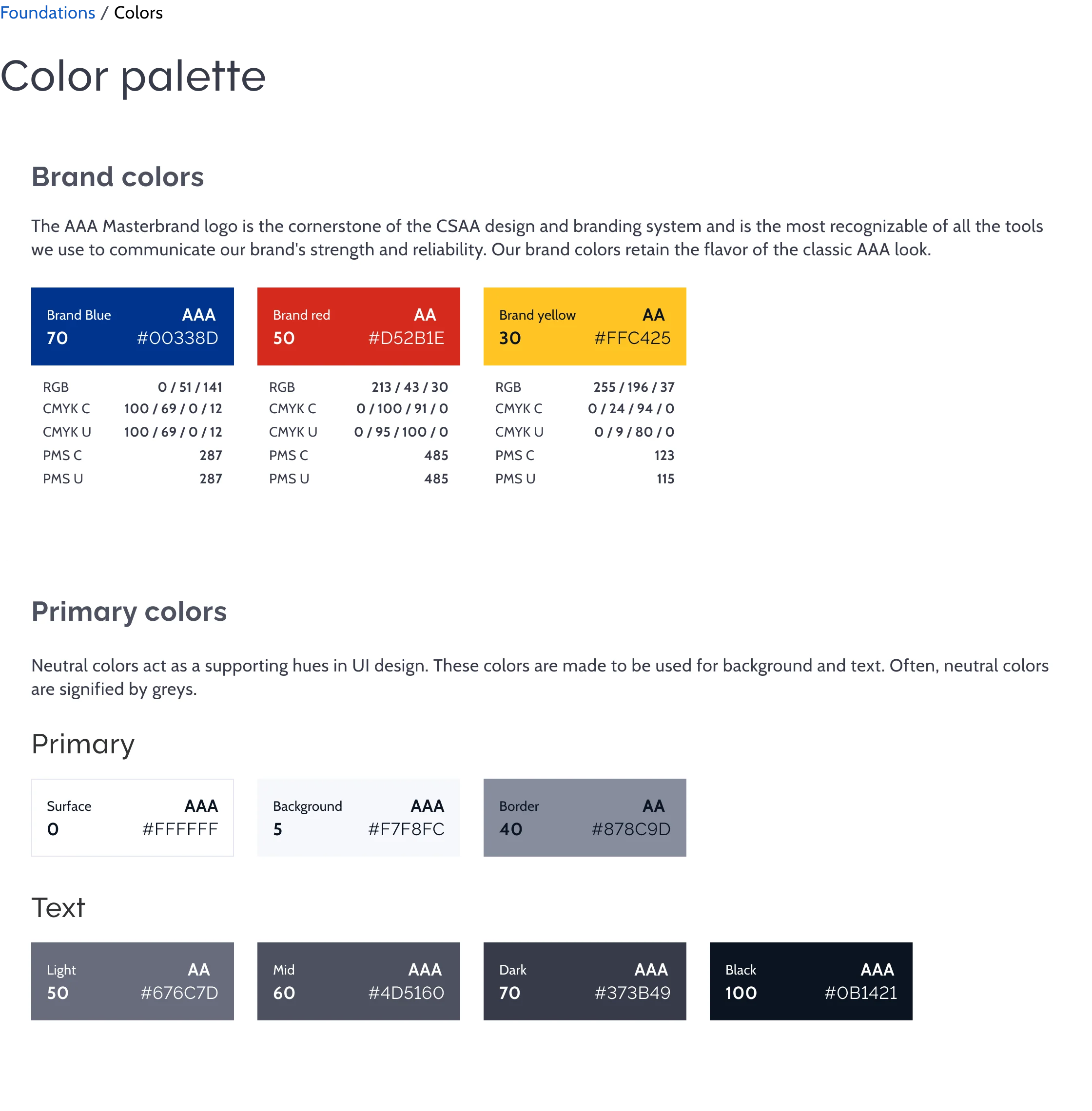
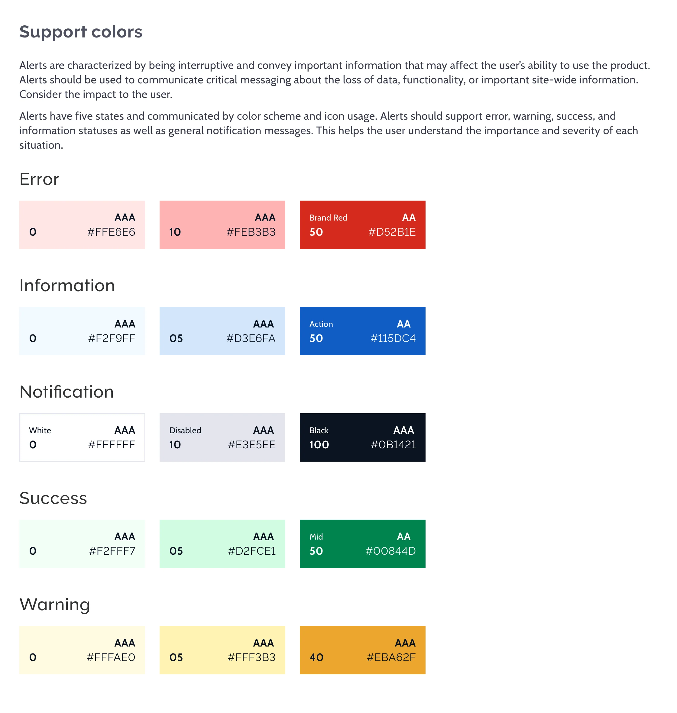
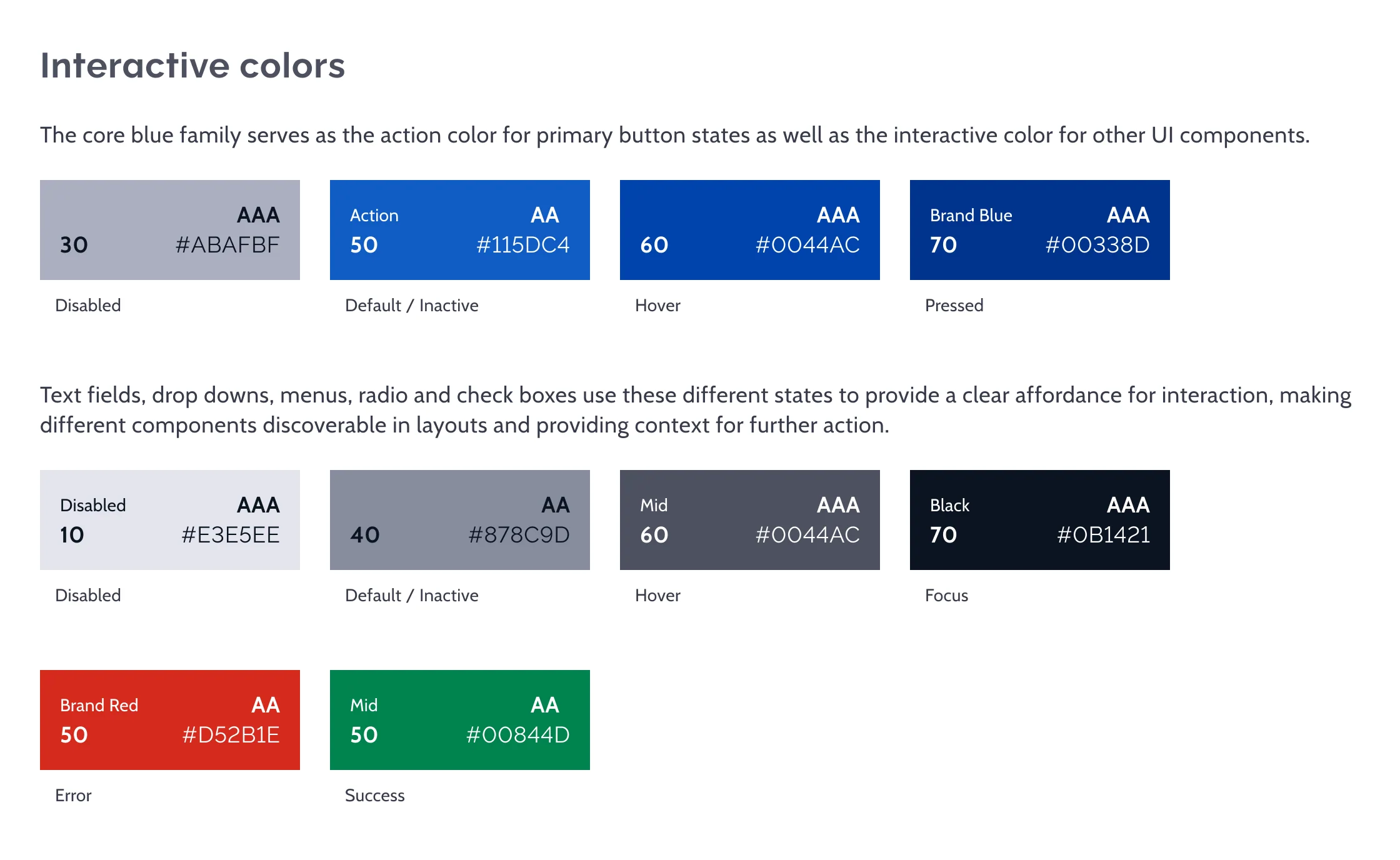
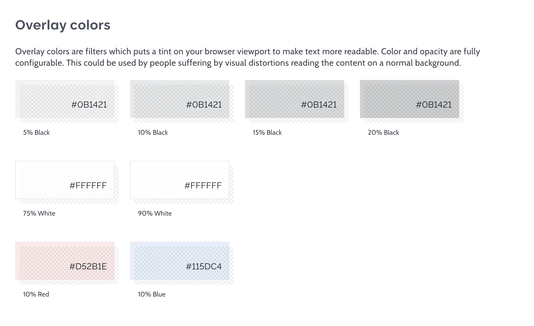
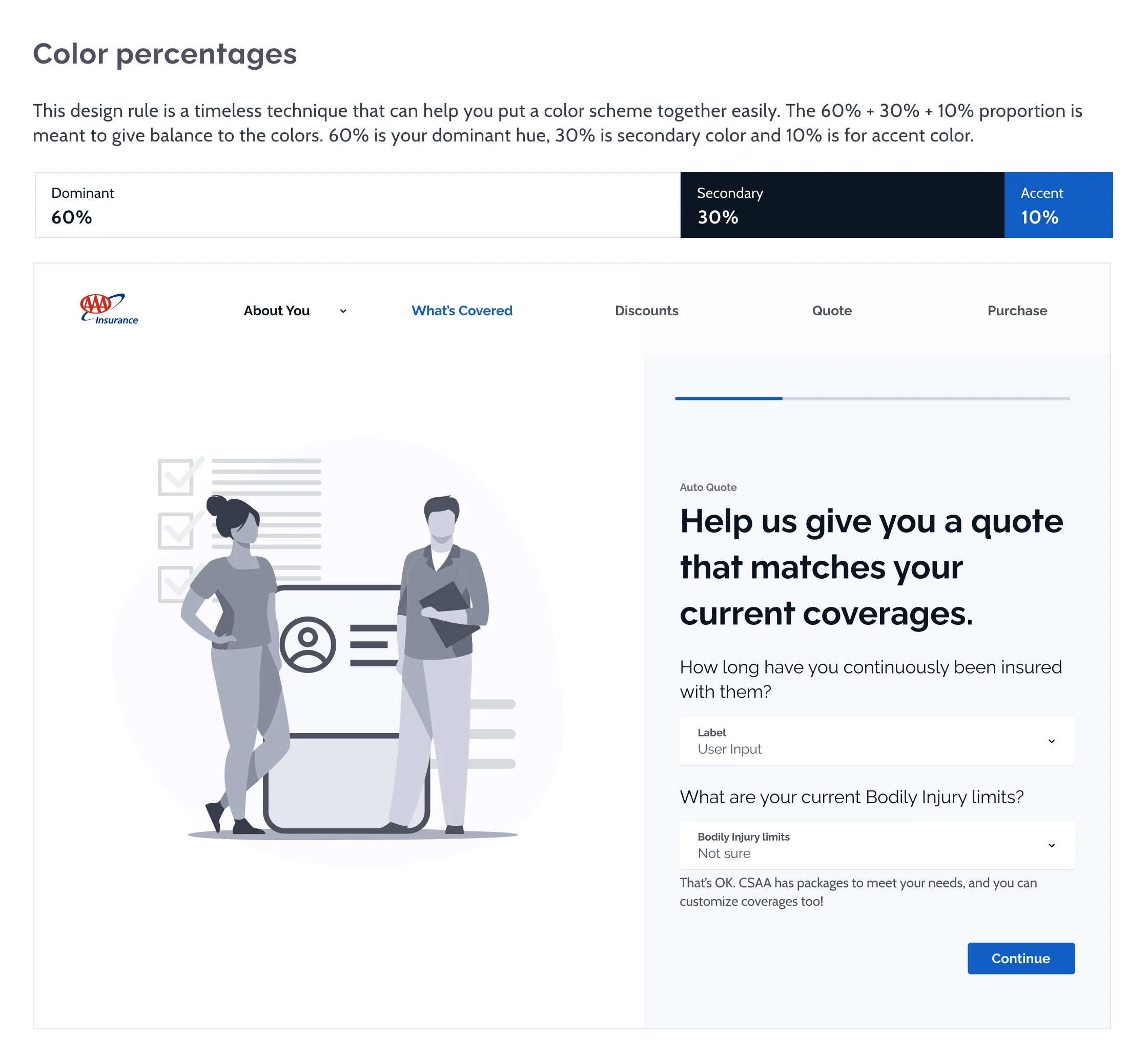
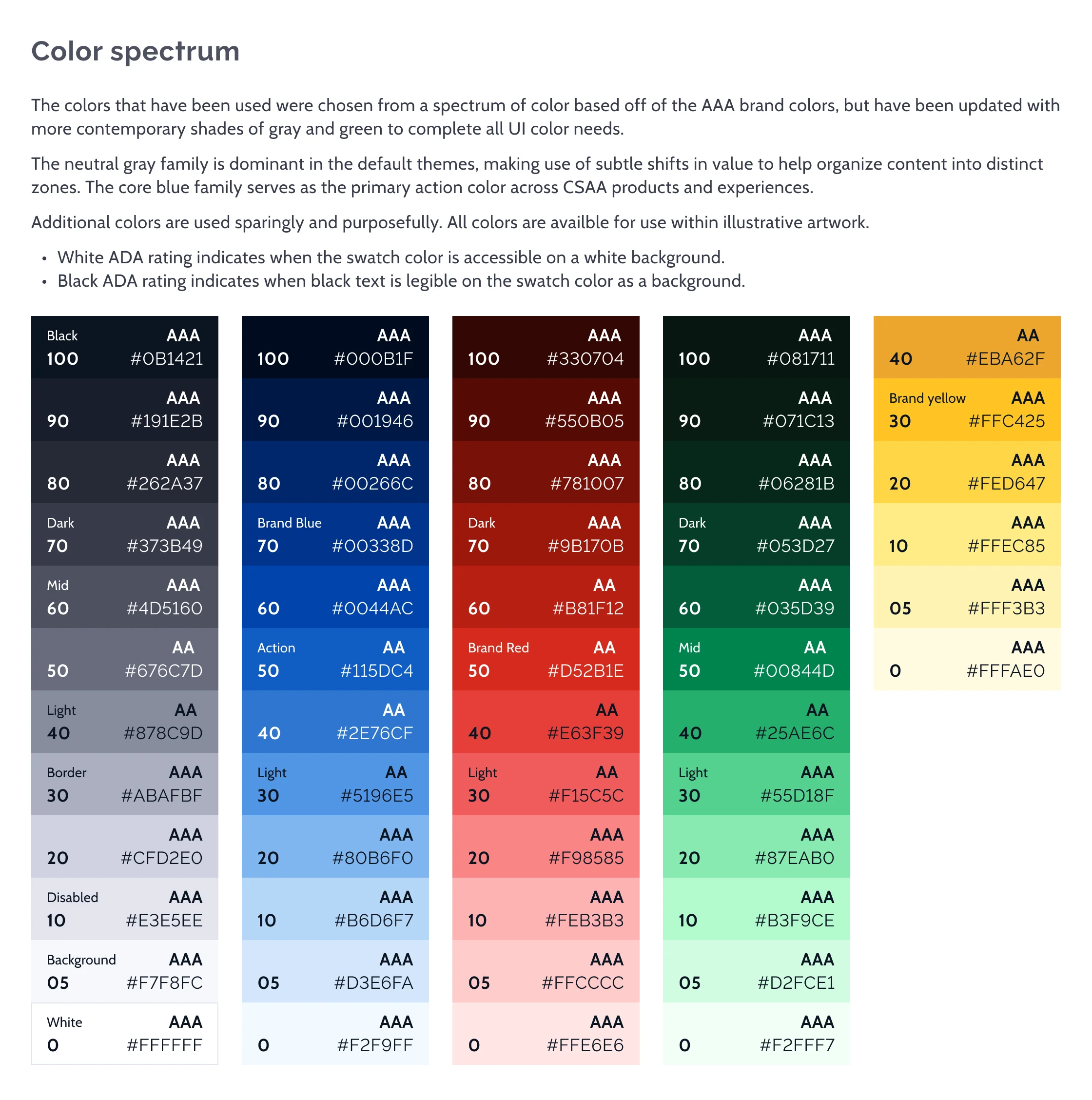
Foundation pages from the Genesis design-system documentation, each a long page under a pinned sidebar: brand color, meaningful and primitive color tokens, typography with mobile and desktop tokens, an 8px grid, spacing, padding, elevation and shadows, and borders, radius and focus states.
Its 8 screens, in order:
- Foundational Color Guidelines
- Meaningful + Primitive Color Tokens
- Foundational Typography Guidelines
- Grid Guidelines
- Spacing Guidelines
- Padding Guidelines
- Elevation + Shadow Guidelines
- Borders + Radius Guidelines
Overview
Lead Designer + 4
As our design system matured, its capabilities and reach grew, and so did its required documentation.
For our next-generation design system, we needed docs that covered:
- In-depth component usage and best practices
- Broke out stylistic guidelines
- How a component’s many states were visualized
Create Creatively
More Capable Components
Rolled out “component templates,” allowing commonly used component combinations to be memorized and further configured.
The primitive component could be templated (i.e., fields such as first name and last name, as individual, reusable templates, and then further combined (i.e., Full Name Component template > Combo First + Last).
Templates could be browsed from docs and easily implemented (and configured).
Do What’s Best
More Documented Guidance
We added new documentation on how to utilize components best. These best practices constrain the creative grey area available to creators by exploring limits and types of configuration.
Implementing these best practices resulted in significant improvements in creator satisfaction while also enhancing UX grades across all experiences. This resulted in better choices being made and a more satisfying user experience.
Do What’s Best
More Documented Guidance
Comprehensive demonstration of each component’s design capabilities for all states configured in Figma (variants/parameters) versus oneUI’s isolated prop sheet documents.
Grade Creators
Grade their creations
Created DS grading tests within the build pipeline that compare component configurations and custom styles to best-practice criteria and assign creators a grade per commit (A- F)
Creators with low grades were mentored until their grades improved. Products with generally low grades would often be refactored until the “best practice” grade improved.