
CSAA · Designer, Dev · Team: +0 · Time: 1 Month (2022) · Front-end, Visual Design
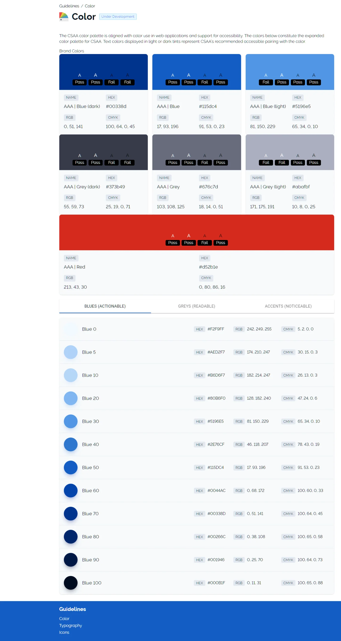
Three pages of a style-guide site, color, typography and icons, generated from Figma, followed by Stylistic Docuponents, the live site of the components that build those pages.
Its 4 screens, in order:
- Dynamic Color Guidelines
- Dynamic Typography Guidelines
- Dynamic Icon Guidelines
- Stylistic Docuponents (a live site)
Overview
Static assets existed in many forms across our products. Often, implementation occurs in various ways, and assets like icons are shared over Slack. Needing to consolidate points of origin, we explored how designers could deliver assets directly from Figma into Git and also how to dynamically generate living style guides from Figma components. We started by focusing on colors, typography, and icons.
Role
With my combined expertise in design and development, I led a rapid effort to develop a Figma plugin, corresponding Figma sheets, and a Gatsby project that automatically updates upon approved Git pull requests.
Objective
With Figma becoming our preferred design tool, I began to explore the feasibility of governing design decisions (tokens) & static assets from within Figma. Enabling designers to push tokens, icons, & typography to developers via Git was the long-term objective. A big issue, especially in enterprise design environments, is how easily designers lose control of static assets. Pasting an icon into a dev’s slack conservation is all it takes for that icon to lose its ability to be comprehensively governed; so, instead, developers should consume icons from an icon package built dynamically from icons found at specific Figma endpoints.
Goals
- Tokens in Figma Update Figma styles (for DS components) to develop compatible token naming conventions.
- Figma to Git Create a Figma plugin that can translate and push content from Figma into development repos (via pull request).
- Living Style Guides Create a continuous build that rebuilds updated style guides whenever changes are delivered from Figma.
Outcome
Colors, typography (including web fonts), icons, and even content were successfully pulled into a Gatsby project (at build) from Figma directly, allowing style guides to be generated dynamically once changes had been committed in Figma. Colors and typography were pulled directly from Figma, while icons were pushed to Git and assembled into an NPM package via a custom Figma plugin.
Accomplishments
- Created Docuponents Published package of style guide components for populating colors, typography, and icon pages dynamically.
- Iconic NPM Packages Iconic NPM Packages
Lessons
- Development Adoption Development teams were less keen on ingesting content into their dev workflows than I had expected. The biggest concerns related to change management. Initially, since I was pulling content directly from Figma and delivering that to development without any Git intermediary, understanding changes was difficult. As the solutions matured, all content was pushed to various git repos as pull requests. Only once requests were approved, updated NPM packages would be deployed. Following the development best practices for understanding and managing code change enabled a 90% adoption rate across development teams.