Component architecture
Gloss
Gloss
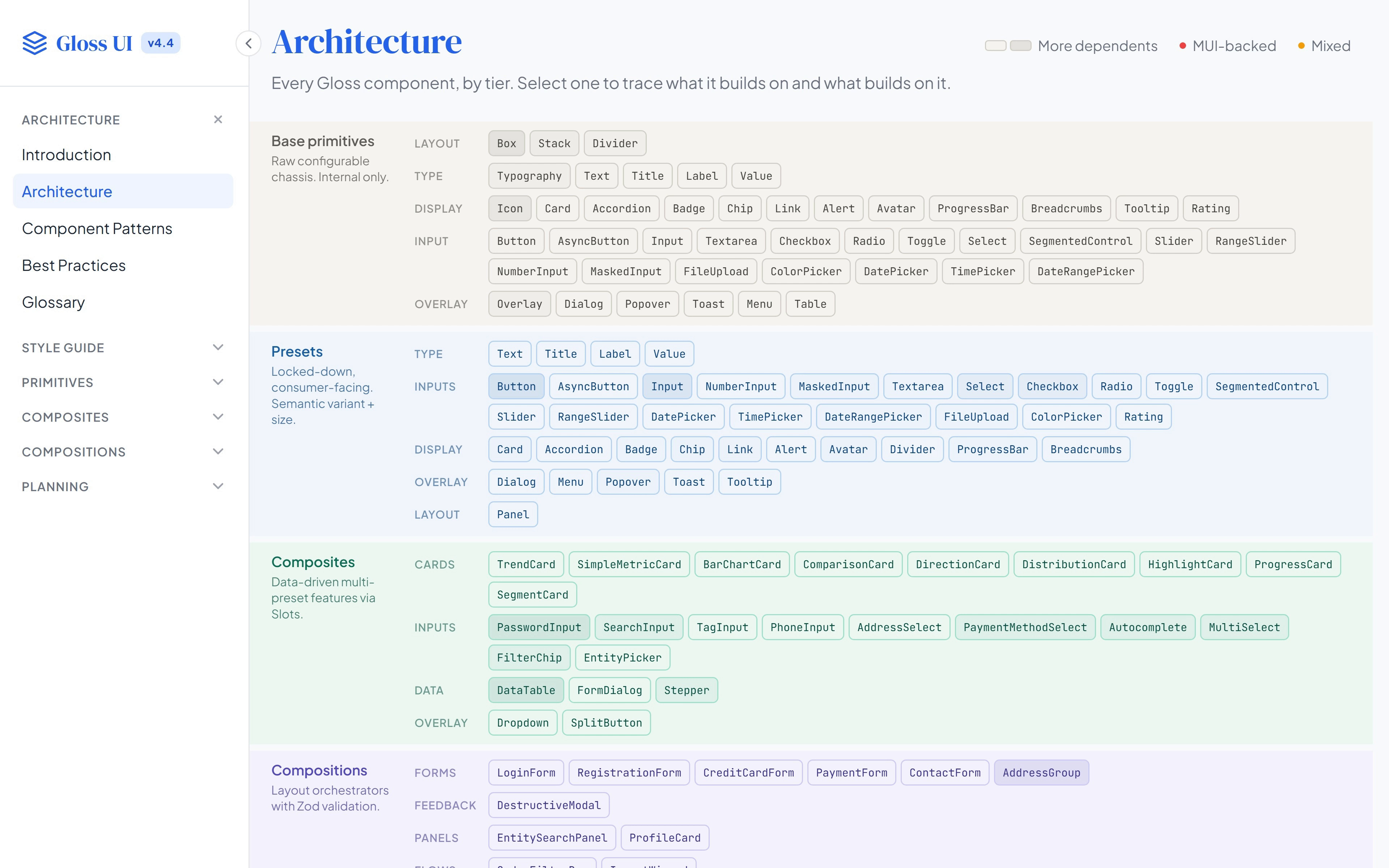
Gloss component architecture In the résumé: Gloss Design System at MarketTime, also known as VersaTrade As Principal Product Designer 2025–26
This chart from the Gloss docs puts every component in a band for its tier. Base primitives are the raw chassis, with every visual knob exposed, and only the system itself uses them. Presets lock those knobs down to a few semantic choices, such as a variant and a size. Composites take data and draw a finished piece, like a metric card or a password field; compositions arrange those into whole sections, like a login form or an import wizard.
Three bands sit apart from that stack. Wrappers add behavior such as sorting or dismissing without drawing anything. Containers restyle whatever sits inside them, so a button in a card header and a button in a dialog each pick up the right treatment without anyone setting it. The last band is the dashboard’s own family: metric cards, chart backgrounds, timeframe controls and the grid they sit in.
Goal: Keep design decisions on one side of a line and configuration on the other, so a product team only ever chooses among options the system has already designed.
Tasks: Separate the infrastructure (the token dictionary, base primitives and variant recipes) from the catalog teams build with, and give each tier a rule for what it accepts: semantic props for presets, named slots for composites, and a validation schema for every form.
Deliverables: The tier chart, an introduction to the tiers, the component patterns, a do-and-don’t page for the boundary between library and app, and a glossary of the model’s terms.
The docs call it the left/right model: the left side is the infrastructure only the system’s maintainers touch, and the right side is the catalog everyone else uses.