Documentation site
Gloss
Gloss
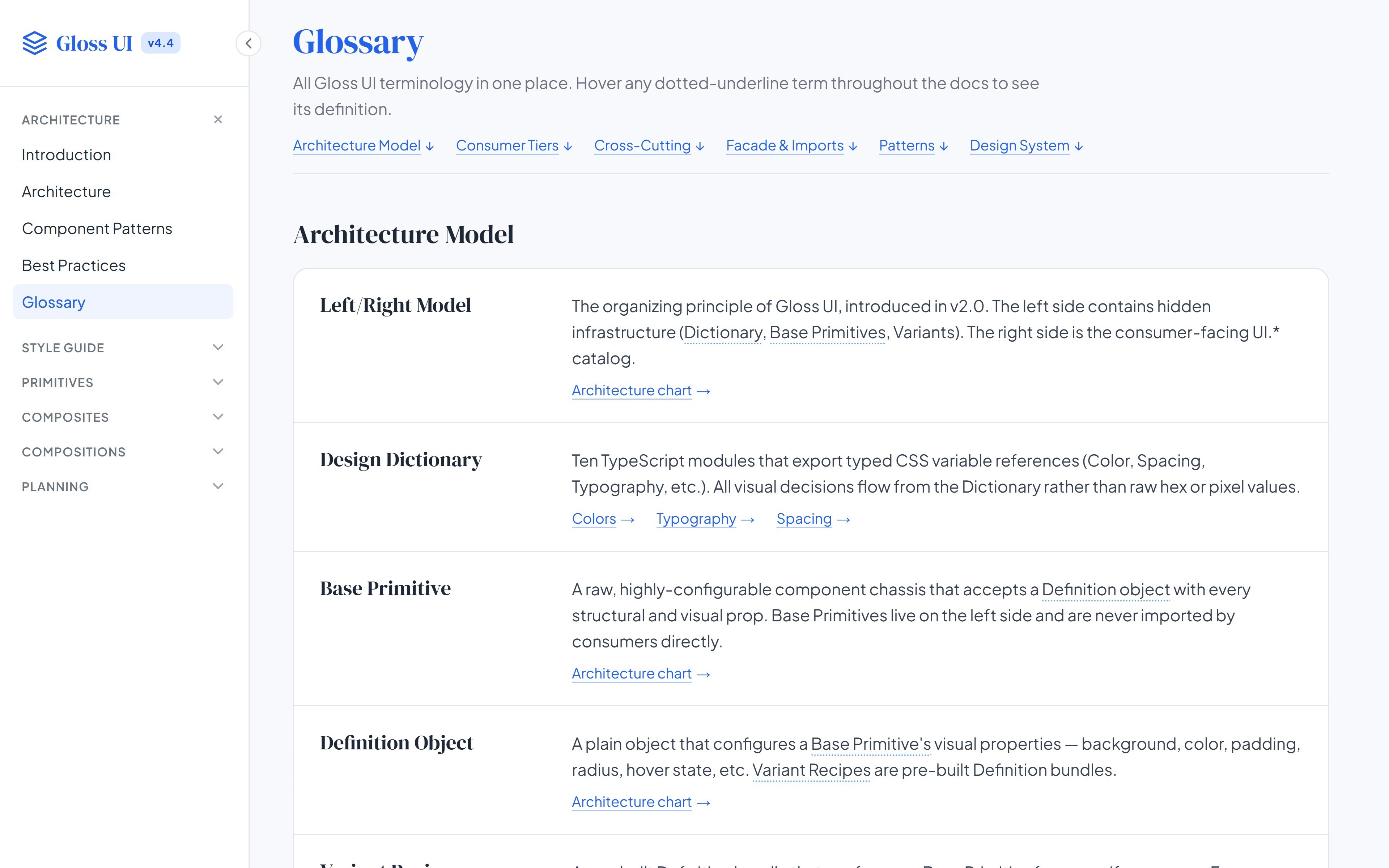
Gloss documentation site In the résumé: Gloss Design System at MarketTime, also known as VersaTrade As Principal Product Designer 2025–26
The Gloss documentation is a site of its own, and the frame opens it at the glossary, where each term the docs use is defined once. A dotted underline anywhere else in the docs shows the same definition on hover, so a word like “preset” or “composite” means one thing on every page. The sidebar runs from the architecture through a style guide to the components, tier by tier.
Architecture: An introduction to the tiers, the tier chart, the component patterns, a do-and-don’t page for the boundary between library and app, and the glossary.
Style guide: The design philosophy, then color, typography, shadows, spacing and a pattern library.
Components: A live page for each primitive, grouped as input, output, actions, forms, pickers and the dashboard’s controls, then the composites and the compositions.
Design philosophy: Inputs sit recessed into the page and buttons stand up from it, so filling a field and pressing a button feel different; color always means something, with blue kept for active states and green and red for validation.