Components in every state
Gloss
Gloss
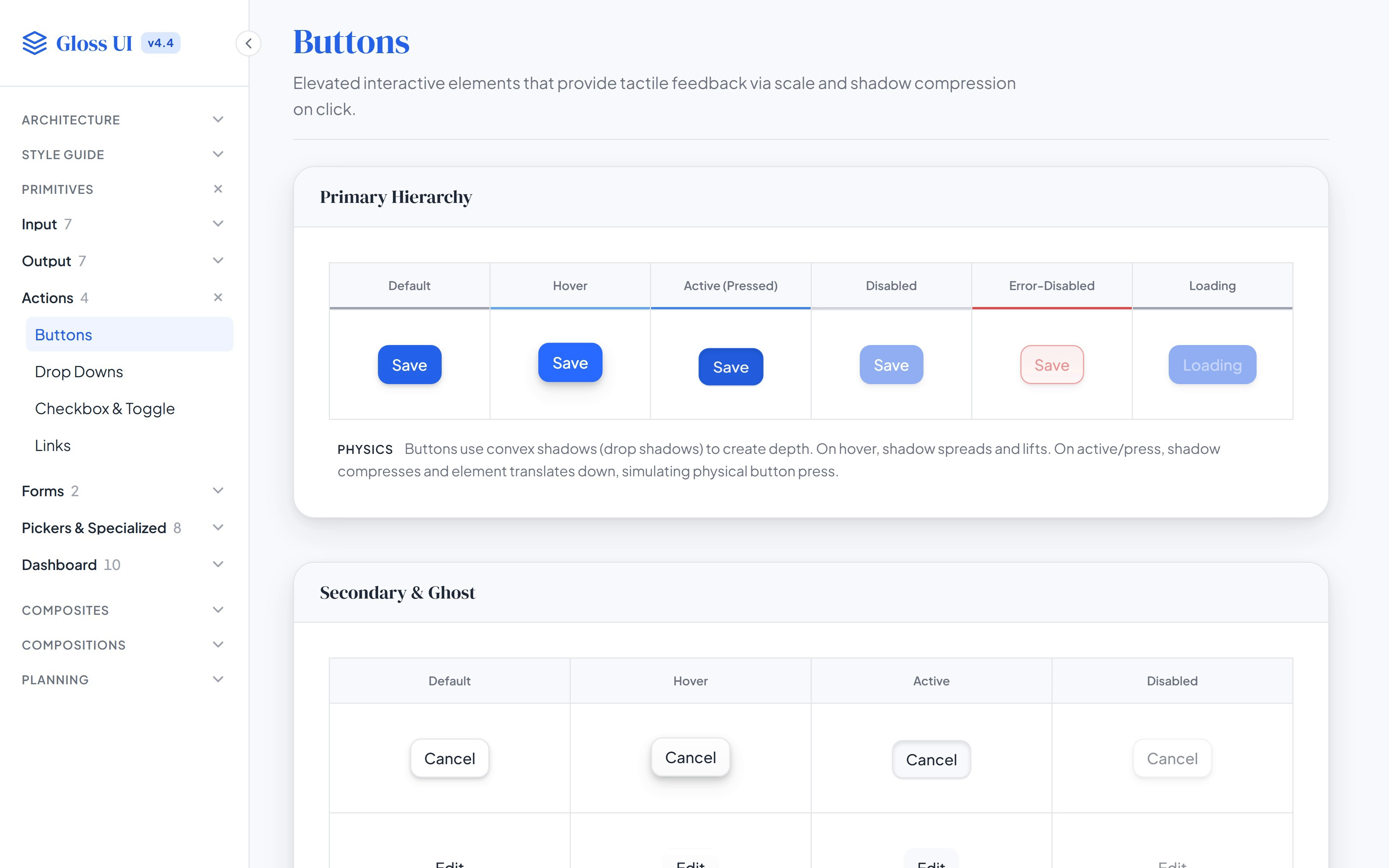
Gloss component examples In the résumé: Gloss Design System at MarketTime, also known as VersaTrade As Principal Product Designer 2025–26
Every component page in the Gloss docs is a working example, and the frame opens on buttons. A table runs the primary button through each state it can be in: default, hover, pressed, disabled, error and loading. A note under it says how the button moves: the shadow spreads as it lifts on hover, then compresses as it drops on a press. Further down, an Interactive Physics panel names the state while you hover and press its button, and the page goes on to sizes, icons and the error state, which stays clickable so it can say what’s missing.
Actions: Buttons, drop-downs, checkboxes and toggles, and links, with secondary and ghost buttons under the primary ones.
Pickers: Date, date range and time pickers, a color picker, file upload, a masked input, a range slider and a rating.
Dashboard: The controls the sales dashboard is built from: the metric card and its grid, timeframes, filter chips, the chart’s control bar, tabs, a breakdown table, a context menu and loading skeletons.
Motion: When something is engaged, its border reacts at once and its shadow follows a tenth of a second later, so it reads as lifting or sinking rather than just changing color.