CSAA · Product Design Lead · Team: +1 · Time: 2 Months (2018) · UI, Visual Design
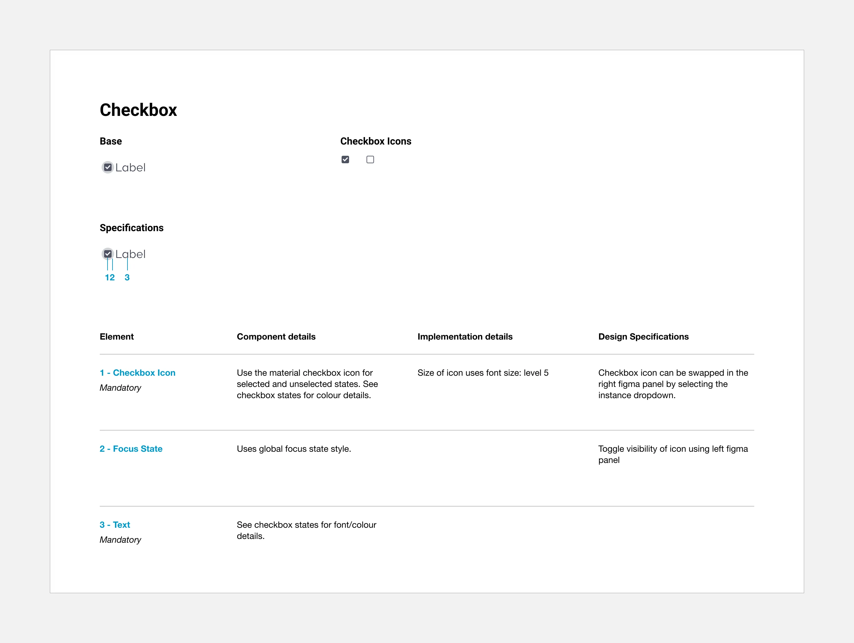
Five component property sheets from OneUI: checkbox, input, field, badge and tag. Each shows the base component and a numbered anatomy over a table of element, component and implementation details and design specifications; the longer sheets add states, recipes, best practices and related components.
Its 5 screens, in order:
- OneUI: Checkbox Properties
- OneUI: Input Properties
- OneUI: Field Properties
- OneUI: Badge Properties
- OneUI: Tag Properties
Overview
This is a property sheet. In my earliest days at CSAA, they helped consolidate design patterns and build consistency with developers.
Role
As the Product Design Lead, I surveyed existing B2C products and began inventorying 80 of the most common patterns. With help from a senior UI designer, we produced property sheets for each.
Responsibilities
- UI Design
- Visual Design
- User Research
Mandate
Transform an unopinionated pattern library into an opinionated UI kit with configurable components.
Time Period
60 - 90 days
Goals
- Establish a first-generation design system, its documentation, and its structure
- Establish component specifications from existing pattern implementations. These should account for what exists while providing enough structure and constraint for what’s coming.
- Create reusable components in Adobe XD.
Outcome
Establishing a single source of truth for UI was challenging, especially given the existing page-level design approach. We created component property sheets that served designers and developers in addressing this.
Component First Foundation
Property sheets facilitated a shift towards component-based design, improved communication between designers and developers, and provided a scalable foundation for the design system.
XD to Figma
We started with Adobe XD and later migrated to Figma. At the time, Figma’s support for shared and configurable components was still maturing, so designers relied on property sheets to understand component capabilities. They could also copy components directly from a property sheet.
Adoption
OneUI revealed the need for a more holistic approach to design system adoption. While new features leveraged OneUI components, the coexistence of legacy UI led to a decline in user experience scores (B- to D+), with 10% of users saying the app felt unprofessional.
Learning
Pixel-perfect was problematic because we didn’t have a pixel grid. Designers worked on different grids, making it difficult for developers to make assumptions. Developers didn’t understand the intricacies of design elements, making it challenging to find the correct property sheets often.
Pixel Grid Standard
Inconsistencies in design and development practices hindered early efforts. Designers used varying grids, making it difficult for developers to implement designs accurately, leading to the creation of the pixel grid standard. A standardized spacial paradigm based on atomic design principles was needed to ensure consistency and efficiency.
Terminology
Discrepancies in terminology and the implementation of elements like icons further complicate the process. This highlighted the need for clear communication and enterprise-wide development guidelines, ultimately leading the design system to assume ownership of specific development libraries. This expanded role, however, created challenges in ensuring a shared understanding of the design system’s purpose and scope across the organization.
Interesting
The icon library was released as part of OneUI, providing the first shared library used by more than two applications. Consolidating the icons was a big job, but it helped CSAA avoid lawsuits related to outdated icons existing long after more diverse and sensitive alternatives were implemented.