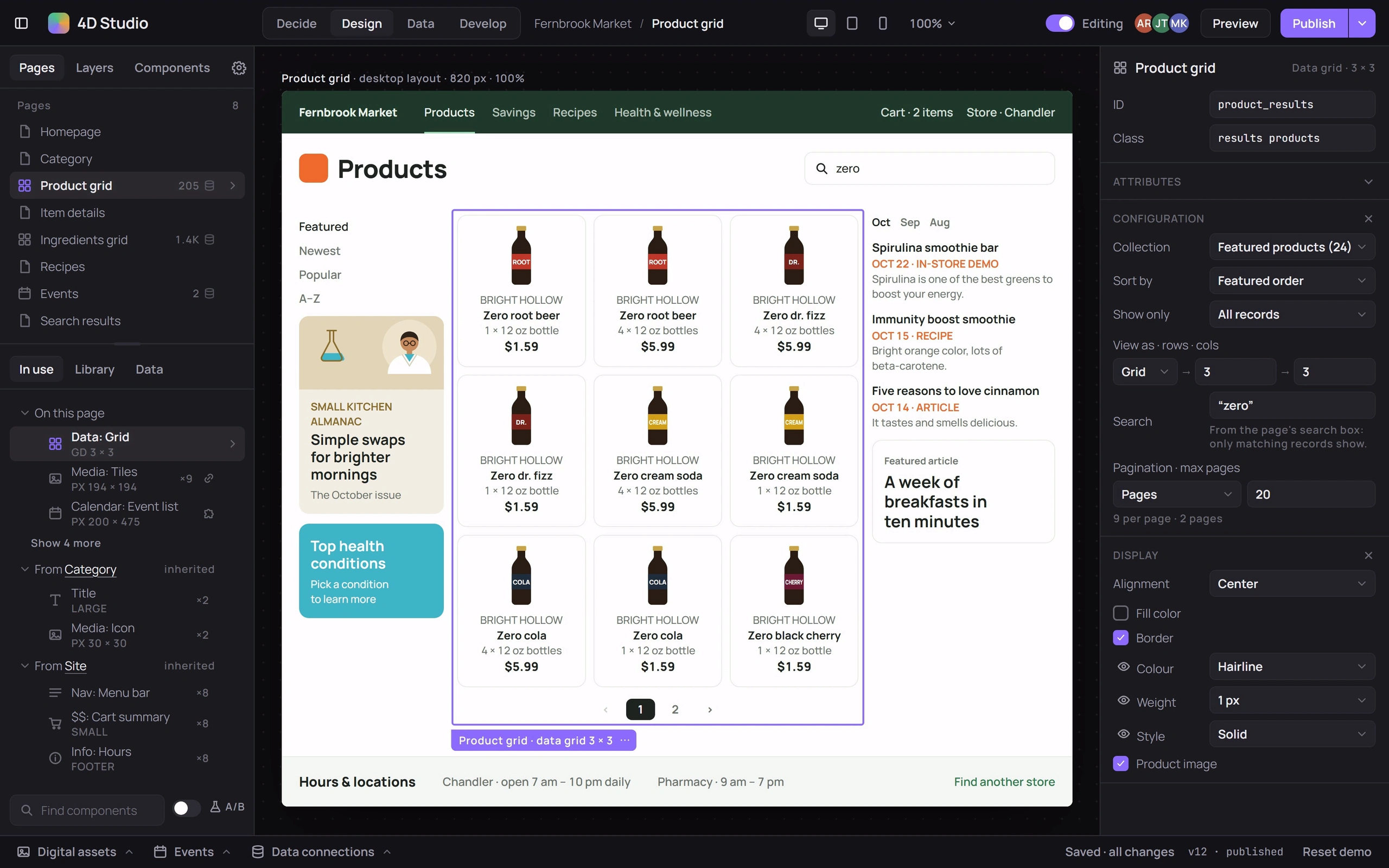
A page builder set in an invented grocery store, Fernbrook Market. Change the product grid’s rows, columns or sort and the tiles glide to their new places; drag an image from Digital assets onto the ad, and Undo puts the old one back; add a data dimension, tick it on two products and filter the grid by it; edit the inherited menu bar for this page or every page; switch the canvas to tablet or phone. Its four modes are Decide, Design, Data and Develop. In Decide a running image test counts results, and ending it puts the winning image on the page. Publish stamps a new version.
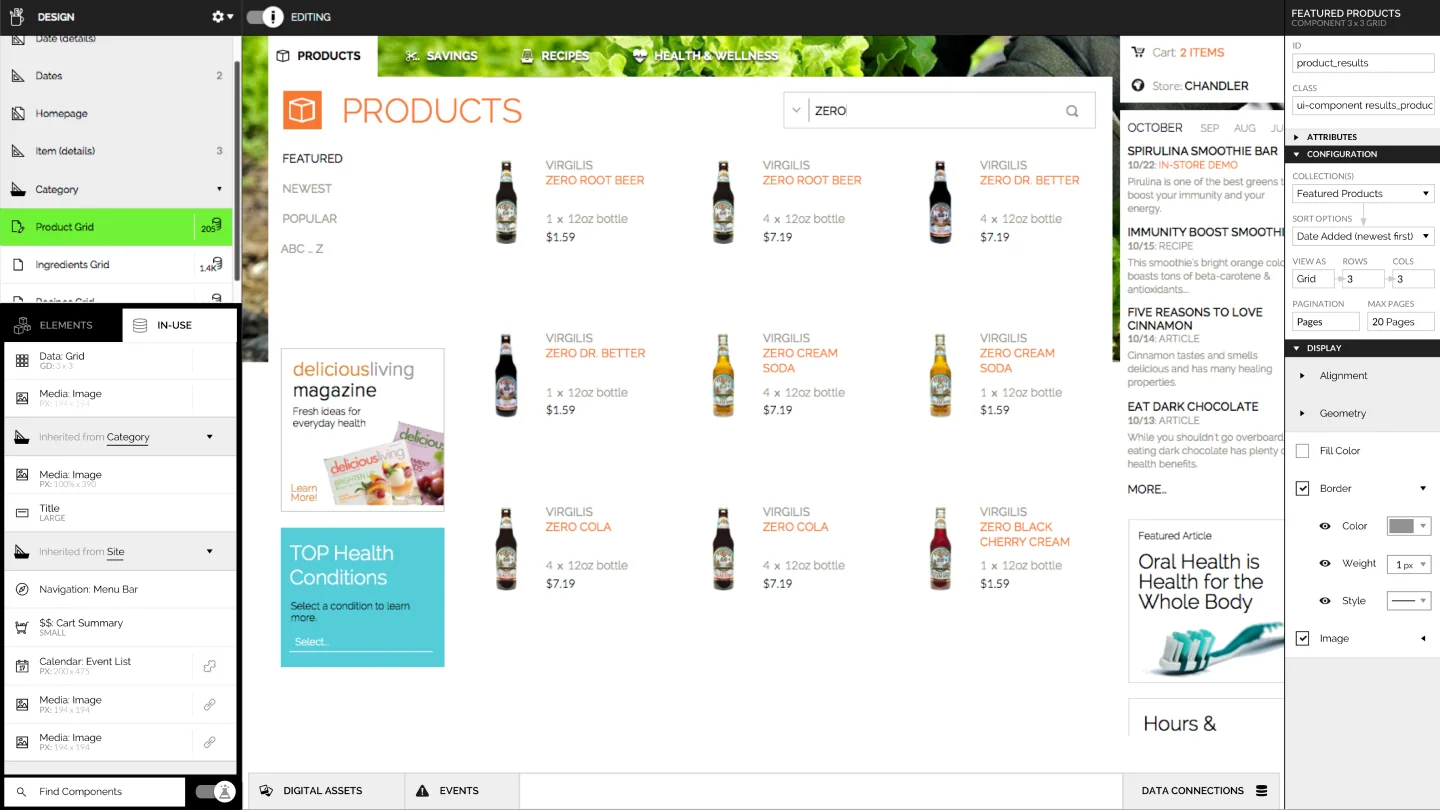
A browser-based page builder, shown editing a storefront: a page tree and element list on the left, an inspector on the right, and drawers for digital assets, events and data connections. The mockups below add a media library, data collections, and a sidebar of experiments, initiatives, goals and audiences.
Wireframes
How 4D Studio works, sketched: its four modes, the design and decide views, one choice about inherited parts, and two states.
1Four modes, one page. Four modes around one page.2Design. Design: the page, its layers, and the inspector for the selection.3Decide. Decide: an image test on the live page.4Editing an inherited part. Asking before an edit spreads to every page.5Undo a swap. Replacing an image, and taking it back.6Phone width. Checking the page at phone width.
Mockups
Next screen
1/64D Studio UI Overview
Its 6 mockups, in order:
4D Studio UI Overview
Inspecting + Editing: When designing, clicking on an element produces a context menu providing options. Edit changes inspectors focus.
Shared Resources: All media used and/or uploaded lives in a the Digital Assets Library.
Shared Resources: External data sources are available in a read-only format. Used to connect data driven elements.
Experiments, Initiatives, + Goals: Secondary view of the left sidebar, providing controls and insight on active experiments + initiatives. Bottom shows all available goals and audiences. May be dragged onto the summary view above or any form reqUIring specification.
Panels + Menu Component: Isolated panels used in elemental sidebar. Shows additional options not relevant in UI use case. Menu’s used and not shown or belonging to actions in outdated UI.