Half the Room Didn’t Like It
How showing the search changed a naming discussion that kept starting over.
The best name I found had to beat a name nobody could say, spell, or put on a slide.
Four B2B wholesale platforms were merging. An employee contest had helped work out what the new company should stand for, and a tool I’d built had taken more than a thousand candidates down to about 30. I brought my choice to a small, close group first, expecting a mixed response.
I got one. Most of them weren’t in love with it, and I had 60 days to find something “better.” Ahead of me were four companies’ leaders, a steering committee, the holding company’s advisors, and the board.
I already knew this was the best name. It fit what we needed now, in six months, and two years out. I also knew how easy it would be to spend those 60 days building a more elaborate defense of my favorite. The alternatives had to get the same brief and a fair shot.
The hardest one to beat was the imaginary name in everyone’s head. It would be familiar but original, broad but specific, and somehow available. Ideally it would feel like the successful competitor’s name, minus the years and money spent making that name successful. You can see the appeal: nobody had found anything wrong with it yet.
I filled out the map in NameForge until I could show what the alternatives gave us and cost us, without asking people to trust my confidence. Then I built the Cartograph, which flew us over neighborhoods of names: all 30 contenders directly, another 1,300 like houses. We even named the neighborhoods: Resonance, Peri-Dynasty, Data & Cognition, Phonetic Twins.
Someone could suggest another familiar construction, and now we could locate it. The room could see what we’d tried there and why we’d moved on. By the end of the tour, the aimless brainstorming had stopped. Nobody pushed back.
The map could have become a monument to how much work I’d done. Its useful job was showing what another round would need to find.
I gave the sensible name a neon accent, while competitors wore blue, green, and black. At the final board presentation, I opened and closed with the same account: half loved it, half didn’t, so we’d tested every alternative.
By slide four, I was showing a basic brand book. We had got from a name people weren’t sold on to a whole identity, without making the committee’s imaginary name available.
That’s the short version.
The remaining 3 minutes cover how I staged the meetings, built the map tour, and carried the name into the identity.
A ranked list left most of that work invisible. People would see the finalists and start throwing out pieces of legacy names or something in the mold of the billion-dollar competitor, trying to close the gap between the name on the table and the one in their head. To the person suggesting it, this was a new possibility; I’d already spent time in that territory, but a slide of finalists gave them no way to see where I’d been.
My strategy was to start small, the way I’d stage the reveal of any creative deliverable. Too many people and consensus runs wild; the right number and you get usable feedback while each person gets to feel like a contributor. After presenting to many small groups, I started a second round with complementary groups of ten or fewer.
For that round, I built the Cartograph, a presentation that flew the audience over the namespace like a map of cities and suburbs, each cluster its own area. Over time, the map had broken into neighborhoods of naming strategies, and where strategies overlapped, they eventually got names: Resonance, Peri-Dynasty, Data & Cognition, Phonetic Twins.
On the tour, the audience saw all 30 names directly and another 1,300 indirectly, drawn in light grey like houses in a city. Sometimes we’d fly over several neighborhoods before settling into one of the six I wanted to explore. They could see the candidate, the constructions around it, and the larger pattern it belonged to.
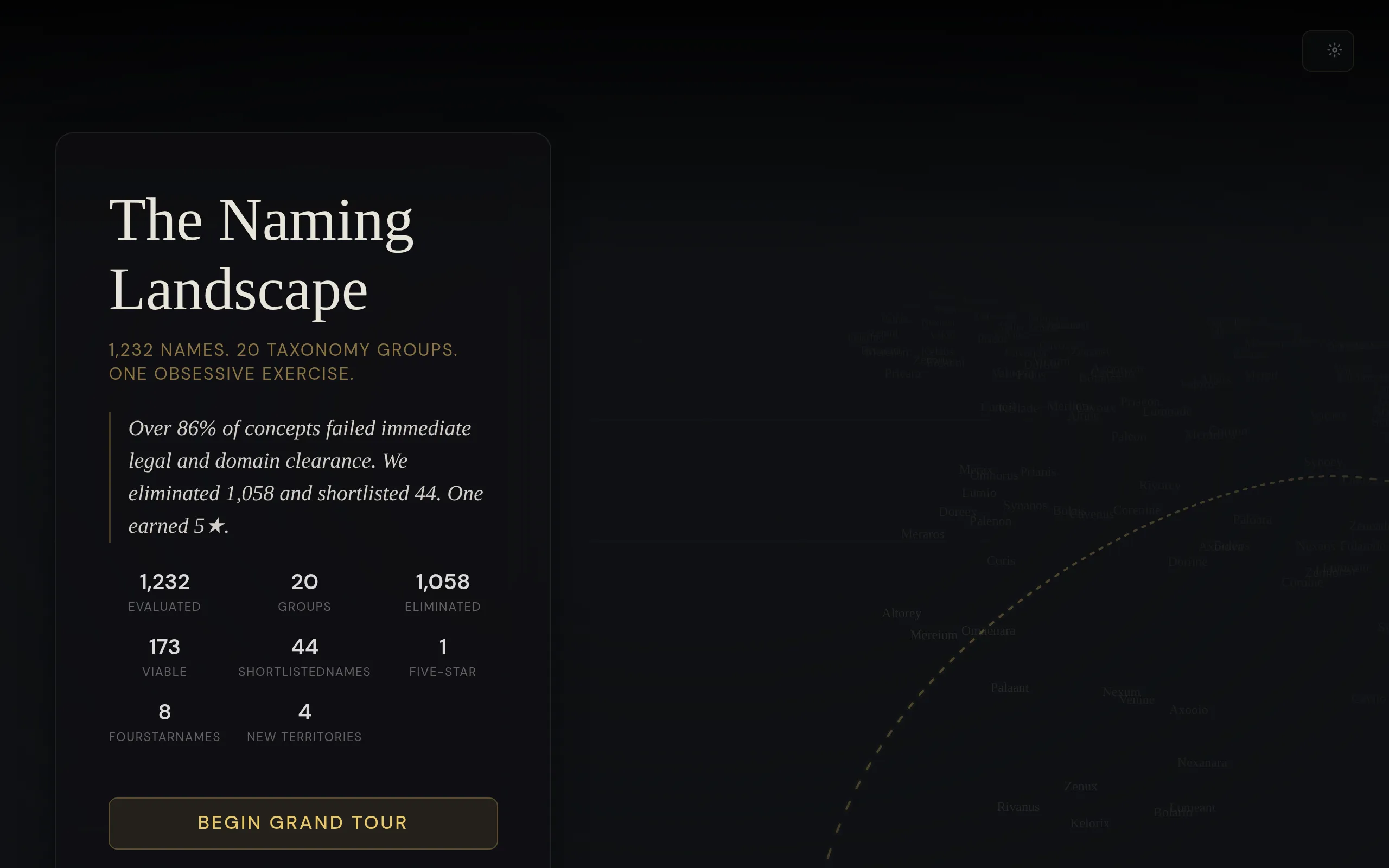
That changed what a suggestion meant in the room. A familiar compound could be located in an area we’d explored. An abstract name could sit next to other candidates making the same tradeoff. People could see why an approach produced plenty of plausible names yet kept struggling with a constraint we’d agreed mattered.
The map gave the discussion a memory.
It also showed the scale of what had been explored, and that part could easily have become an argument from exhaustion: surely nobody wants to make me do all that again. Organizing the names by approach gave the room something more useful to do with them. What would another round be looking for that this one hadn’t?
By the end of the Cartograph tour, the aimless brainstorming had stopped. The legacy constructions and other directions people kept reaching for were already there, along with the reasons we’d moved on from them. Nobody pushed back. That’s how I sold it.
Design is still an art form, fueled by inspiration, and data, user feedback, AI, and the patterns everyone already knows are all inputs to it. What matters is which job you hand each one. With the name, I let the data do the arguing, because the job was consensus, and it’s hard to re-propose a legacy name after flying over the 1,300 we’d already tried.
The identity was a different job.
The competitors I examined dressed in the same blues, greens, and blacks, including the one that had spent a fortune on a single perfect word. A new name in that palette would look like another relabel, and our customers had sat through enough of those. The data showed me where everyone else had gone, but I still had to decide where to go instead.
So I kept the name sensible and put the risk in the paint: a traditional-sounding name wearing an unexpected neon accent, like a middle-aged person asking their stylist for a neon streak. The new products would do the rest.
By the fourth slide of the board presentation, I was presenting a basic brand book. It took the almost undersold quality of the name and blew it up into something far more dynamic and distinct in the space. One mark carries the whole system. It started as a bespoke ligature in the wordmark, and now it propagates across every surface the brand touches.
Look back through the contest, and its loudest instinct was to name the company after one kind of customer. The name we chose refused to pick. The platform I’d spent months designing a dashboard for had made that choice a long time ago.